Fundamentals of Design: Colour
Colour is an important part of daily life, and also an important design element. Just as it informs us about our environment, it can also be used by designers to inform users of how to interact with their design. In the world of UX, colour is used to draw attention, show relationships, lead the eye, convey product branding, direct the user journey and deliver deeper symbolic meaning. The relationship between user and product is very important when choosing colour, as personal perception, culture and even physiology can change the way that colour is interpreted.
How do we see colour?
Humans see colour using cones in the retina of their eyes. Wavelengths of light hit surfaces around us, which pass into the eye through the pupil. From here the light passes to the back of our eye, where the retina is found. The retina contains a round-about total of 126 million light receptors, called rods and cones. Rods (120 million) perceive values of light and dark, and cones (6 million) perceive colour.
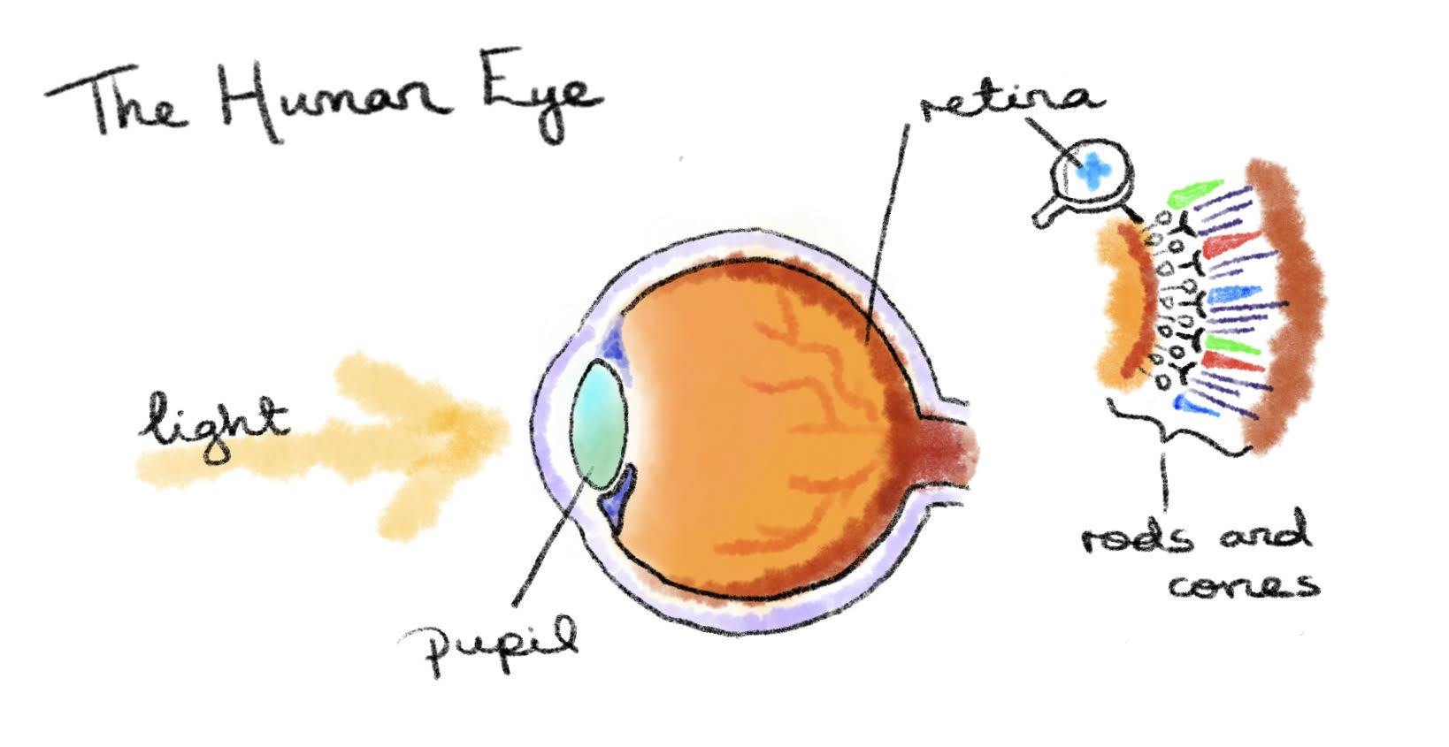
Each cone is one of three types: a red receptor, a green receptor or a blue receptor. A combination of how much these red, green or blue receptors are stimulated is responsible for the colour that your brain perceives. The way that our eyes understand colour using red, blue and green receptors is mirrored in our understanding of colour on a computer, where we often use ratios of RGB.
Above: use the sliders to generate colour using different ratios of red, green and blue. Credit: Mark Lee
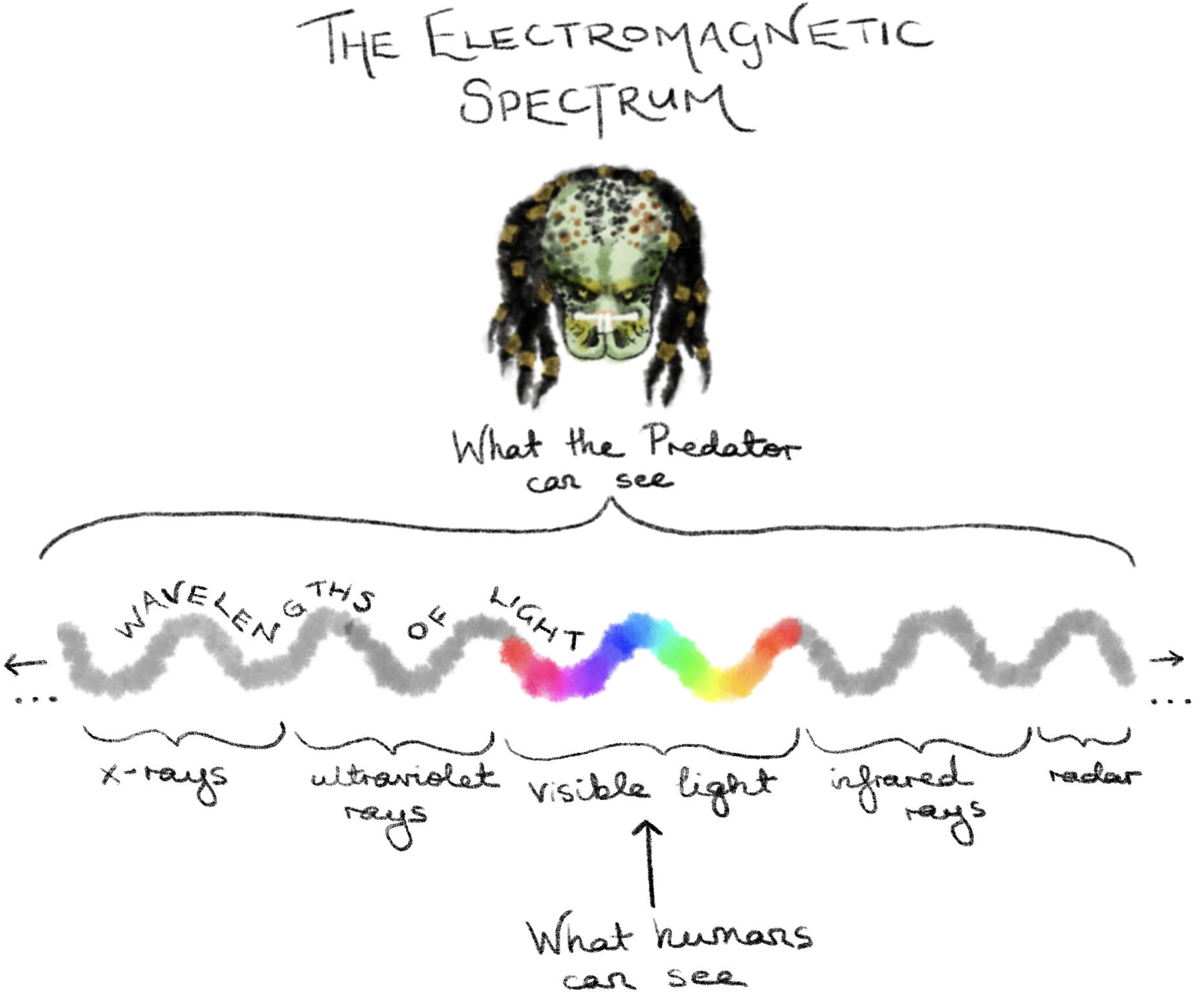
The colour spectrum that humans see is called “visible light”. It is a comparatively small section of all known wavelengths of light, that contains our “rainbow” of colour. On one end sits ultraviolet light, which some insects are geared towards, and on the other is infrared light, which can be seen by some snakes.
How do we represent colour?
Our visible spectrum of colour is often represented as a colour wheel in a triadic segmentation. The three primary colours (red, blue, yellow) are shown with the range of colour in between them. However, this colour wheel does not truly show how we see colours in the world around us. To better explain this we could use the Munsell colour wheel.
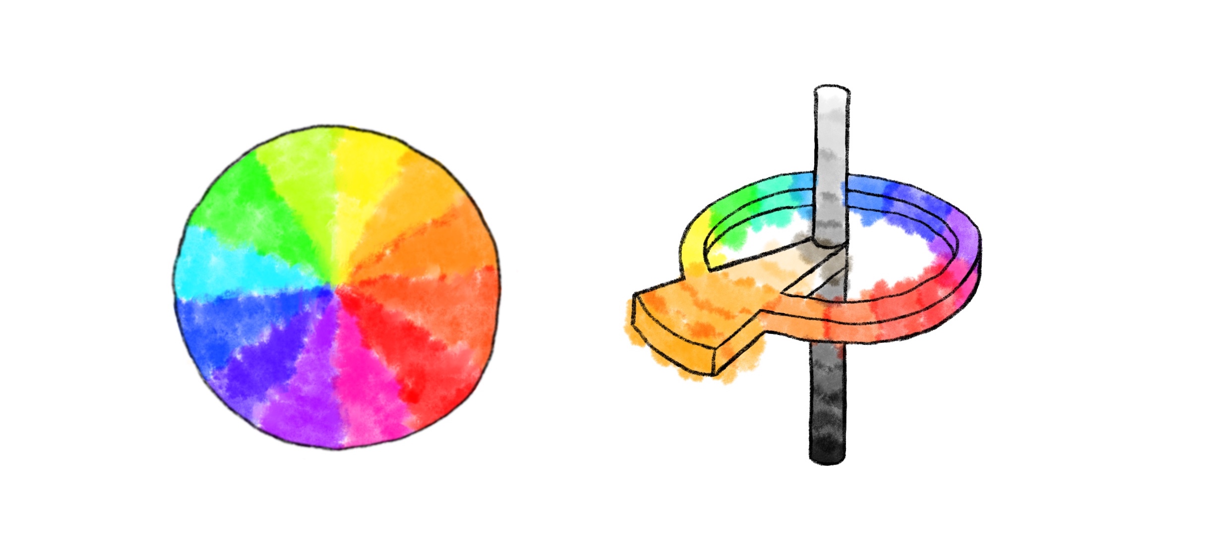
Above, left: The 2D colour wheel. Above, right: The 3D Munsell colour wheel.
The Munsell Colour wheel is three dimensional and depicts hue, value and chroma (or saturation in computer terms). The hue accounts for the 2D range of the triadic colour wheel, although it is now thought of as a ring. The ring slides up and down a value rod, which ranges from darkest (black) to lightest (white). As the ring moves up and down the hue lightens and darkens. Thirdly there is horizontal rod perpendicular to the vertical value rod that accounts for chroma. Chroma can be thought of as the intensity of colour. In painting if would be the amount of pigment used. On a computer it is known as saturation. At one end of the chroma rod the colour is dull, and at the other end it is bright. A good understanding of these elements that make up our understanding of colour is incredibly useful as a designer, especially when communicating colour to users and clients.
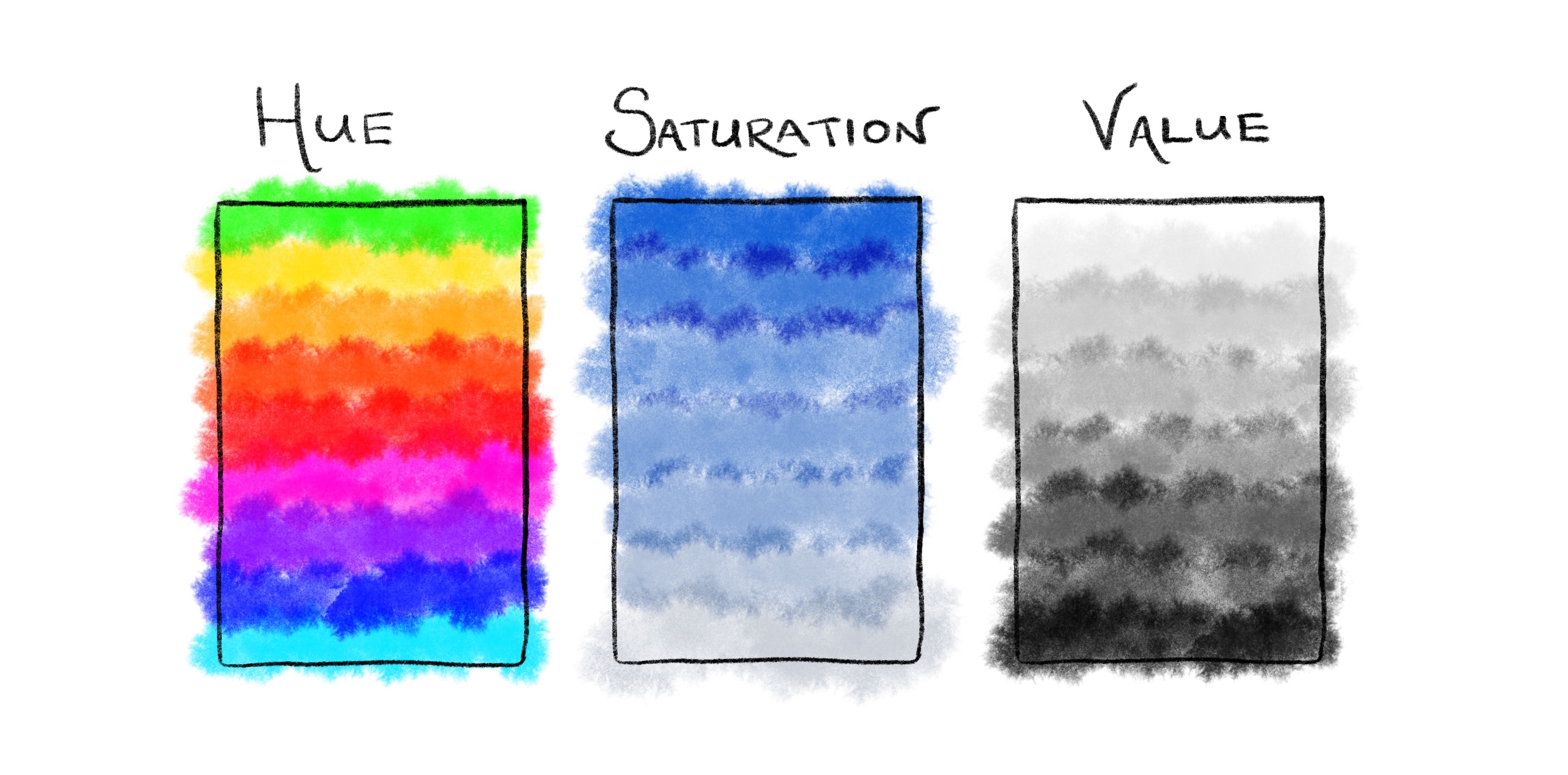
Beware of the difference between saturation and chroma! We can think of saturation as colour on a computer and chroma as the pigment colour in ink. On a computer, colour is presented on a screen that is made up of light, therefore there is high saturation through all values. However, when colour is printed on paper sometimes the same colour cannot be achieved with chroma in the ink. This is because, although white, printer paper is not made from bright light. When black is printed on that same printer paper, it is not as dark as on a computer because the paper is a surface that reflects light. On a computer, darkness is the complete absence of screen light. In this way we can see how the value range is severely diminished for printing versus what we can perceive on the screen.
When designing for web and software products, the colour on the screen is what we care about. Without the limitations of printed colour, the screen is our digital oyster. So what does limit us? What leads us to make certain colour choices over others? This is where user consideration plays a critical role. What limitations do our users have? What culture do our users share? What do our users think “looks nice”? Let’s answer these questions in reverse order.
What looks nice?
It is important to understand colour relationships in order to create a product that is visually pleasing and directs the user in a non-confusing manner. Some examples of colour relationships are:

A helpful resource to demonstrate these different colour relationships is the Adobe Colour Wheel. Here you can select various relationships in the dropdown, and drag to create different variations. As you will see, triadic splits itself at points equal thirds of the wheel. An example of a triadic relationship would be the three primary colours of red, yellow and blue. A monochromatic relationship refers to different values of the same colour. Think of the Munsell colour wheel here, where the wheel does not spin but the value rod moves up and down. A complementary colour relationship refers to colours that are directly opposite one another on the colour wheel. For instance, red and green, or gold and blue. “Complementary” seems like a misnomer, as these colours are difficult for our eyes to see together. They can be thought of as contrasting colours. The reason that our eye has a hard time viewing complementary colours directly next to each other is due to the way that our retinal cones process colour. Our red cones and green cones cannot process receiving red and green light wavelengths at the same time, and so they take turns in a way that makes complementary colours appear to vibrate. This is why the following complementary example is not only difficult to read, but also likely to give you a headache. However the analagous colours example has oceans more chill.
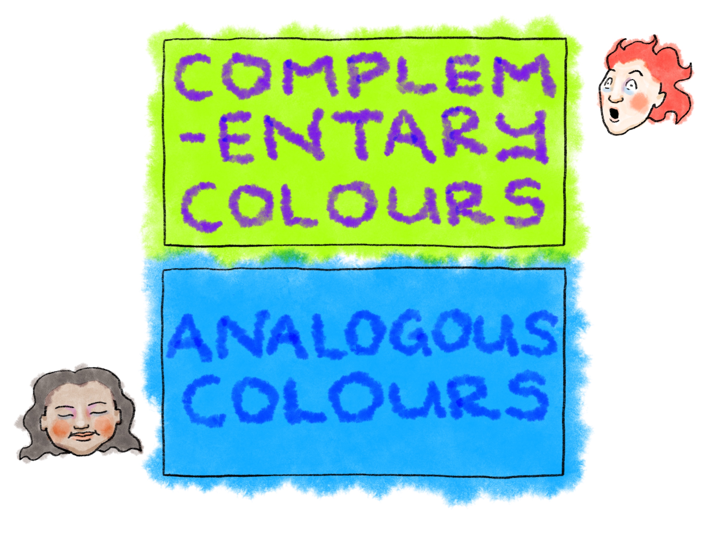
This may lead one to think that using complementary colours is a bad idea when creating user-friendly websites, but it can be used in such a way to highlight and draw attention. Take the Twitter sign-in page below as an example:

Twitter uses monochromatic blues primarily, as part of a strong brand identity. In fact when imagining Twitter’s colour scheme it is easy to think of seas of blue and blue alone. But look closer at their sign-in page and you what do you see? A touch of yellow in the log-in inputs, to compete with the blue surrounding it. This is purposeful, to draw the user’s eye to the area where their action and input is needed. This use of complementary colours is intentional physiological manipulation, and it works incredibly well.
Choosing Colours for a Delightful User Experience
When choosing a colour palate for user experience a good rule to follow is using split harmonious or split complementary relationships. Choose a colour, then select colours either side of its complentary opposite, but not quite its triads. Here is an example:

This palate is great for creating visual interest and leading the eye to parts of the website that you want the user to notice or spend time, without being too visually harsh. The idea is to use the analogous, near colours the most (these are the harmonious colours) and use the contrasting third colour to highlight and accent. Remember also to use near white or near black, and greys. Creating an absence of colour allows your colours to be more powerful rather than overloaded and intense. Overall, it’s cool to use colour for accenting, drawing attention, manulating the user and making this pop, but at the same time it is important to maintain some chill.
After all you don’t want a website as overloaded with colour and therefore as confusing as this one:

Phewf!
What culture do our users share?
Another important consideration is user culture. For each culture different colours are used to represent certain ideas and symbols. A common example of this in Eurocentric culture is the use of green to convey success, going forward, passing, and red to convey an error, stopping, stalling or going back. Consider Twitter’s branding colours again. The light blue that they use invokes a sense of freedom, the blue sky, endless possibilities. If we were to read into it we could even say that the freedom associated with the blue also creates the perception of free speech. This may seem ridiculous, but these kinds of ideas are strongly regarded by branding and marketing departments.
So because of this, employ care and empathy when choosing colour for your product. Some common patterns in colour symbolism in England might not be the same in Indonesia. Colour conveys emotion, and the aim is to trigger a positive emotional reponse to your design rather than a negative one.
Accessibility - What Limitations Do Our Users Have?
So far we have talked about colour from the point of view of the writer, who perceives colour in the way that is typical of most of the world population, but what about those who see colour differently? 8% of men and 1% of women globally are affected by some form of colour blindness. There are many different types of colour blindness, but a common experience is a difficulty in differentiating between certain hues.


Above, left: normal colour perception. Above, right: red blindness.


Above, left: green blindness. Above, right: blue blindness.
Colour blindness is caused by deficiencies in the retinal cones that perceive colour. For instance, if someone has deficiencies in their red cones they can be described as having red-weak or red-blind sight. This will cause a difficulty in differentiating between red and green shades. Think back to the example of using a green button to symbolise going forward and submitting a form, and a red button to symbolise going back or cancelling an action. To someone who is red-weak or red-blind, these buttons will look very similar, if not the same. In this case using something alongside colour to convey meaning, such as marking buttons with stand out text like “Submit” or “Cancel” is imperative. Even in people whose sight is considered normal, there are differences between them in how they differentiate between colours. An interesting measuring stick is this Munsell hue test, which determines one’s level of determining minute differences in hue, and which colour wavelengths might be more difficult for your retinal cones to process.
Some people with colour blindness live with Monochromacy, which is vision with a complete lack of colour. People with Monochromatic vision see in value only, so for these users it is important to define relationships and difference using contrasting value. For instance, to someone with normal colour perception two colours of contrasting hue but the same value will be distiguishable. However to someone with Monochromacy they will not. A useful tool to check contrast for colour value with accessibility considered is this contrast checker.
Colour and value are indispensible in UX design. Colour can be used with purpose to determine how your user will interact with your product. Overall it is important to consider the user’s relationship with colour in order to design effectively. A sound knowledge of colour theory and well as the science behind how we perceive colour should guide the designer’s hand to create products that can be useful and enjoyable to people from a multitude of cultures and a range of abilities. Ultimately however, empathy with their end user is the designer’s most important tool.